The Best Alternate Maps of London
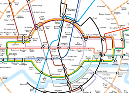
We recently released a 1000 Londoner documentary about Max, a psychology professor who has a sideline in creating some amazing, unique reimaginings of the London Underground Tube Map. One of these maps you may be aware of as it went somewhat viral a few years ago. The map reimagined the Underground as a series of concentric circles, complete with London Transport roundal at it’s centre. Max describes the map as a cartographic joke that somehow resonated with people and which, in my opinion at least, is actually an incredibly effective map. Try it out one day as a replacement for the regular tube map and you might be surprised at the ease with which you can get around. It especially makes the new and still mildly confusing London Overground network easier to understand.
Max isn’t alone though in mapping the city in unique ways. We’ve tracked down some amazing blogs, articles and websites for you to explore featuring some brilliantly different ways of looking at the city;
Mapping London
Mapping London is the ultimate blog for cartography enthusiasts with a soft spot for London. You can spend hours exploring this site and all of the unique ways of looking at the city. My personal favourites are a map of the Public Gardens in the city (for when the concrete jungle just all gets a bit too much) and an interactive map which, using geolocation technology, allows you to see all the tweets being sent at one and where they are being sent from!

http://mappinglondon.co.uk/2015/public-gardens/
http://mappinglondon.co.uk/2014/all-the-tweets/
The Londonist
London internet hub (and 1000 Londoners enthusiasts) The Londonist recently posted this fascinating video which documents the evolution of the London Underground system using graphics to create and draw the map we all know today. A really interesting watch for anyone with even a cursory interest in London’s subterranean transport system.
http://londonist.com/2015/06/watch-this-3d-animated-timeline-of-how-the-tube-map-developed
How happy is your part of London? Before you say “intensely miserable and soul crushing” (you’re a Londoner, don’t deny it, that is always your default answer whether it’s true or not) I recommend you check out this amazing interactive map from The Happy Forecast. Using social experiments and observations of “everyday micro-interactions within public spaces; positive and negative body language, audible factors, physical acts of kindness and aggression etc,” they’ve put together a beautifully rendered map which you can spend hours pouring over to discover just how happy (or miserable) your local area is. Oh, and for the record, my local area received the rating “promising,” so that’s good to know.

http://www.thehappyforecast.com/
Yes, we’re referencing the home of the list article in our own list article but for good reason. Buzzfeed put together this list of alternative tube maps and what’s featured right at the very top? Why, it’s Max’s own circular tube map!
Aside from that, there are some brilliant pieces featured in this article. My particular favourite is the map which shows the stations with public toilets. London’s a big place and that kind of knowledge can be real lifesaver… Oh, and of course, I’m a big fan of the Doctor Who underground map featured here. If the Central line was bigger on the inside it would certainly make that commute more pleasurable.

http://www.buzzfeed.com/expresident/london-underground-maps-you-never-knew-you-needed#.yiGPY8B7v
Do you know anymore articles or maps we should feature? Why not send as a tweet with a link and let us know! We’re @1000_Londoners on twitter and we’d love to hear from you.
